Design systems: Scaling style
For many developers, frontend development is the first time they have to work with a designer.
There are many types of designers, and you are probably working with a product designer (as opposed to a visual designer). Simply put, the job of a product designer is to understand the user problem and create a product that solves it, using principles of design thinking . It is your job to build that product.
Designers output “mocks” or still images of what the product should look like, along with documentation of any edge cases to be mindful of or transitions that aren’t immediately obvious.
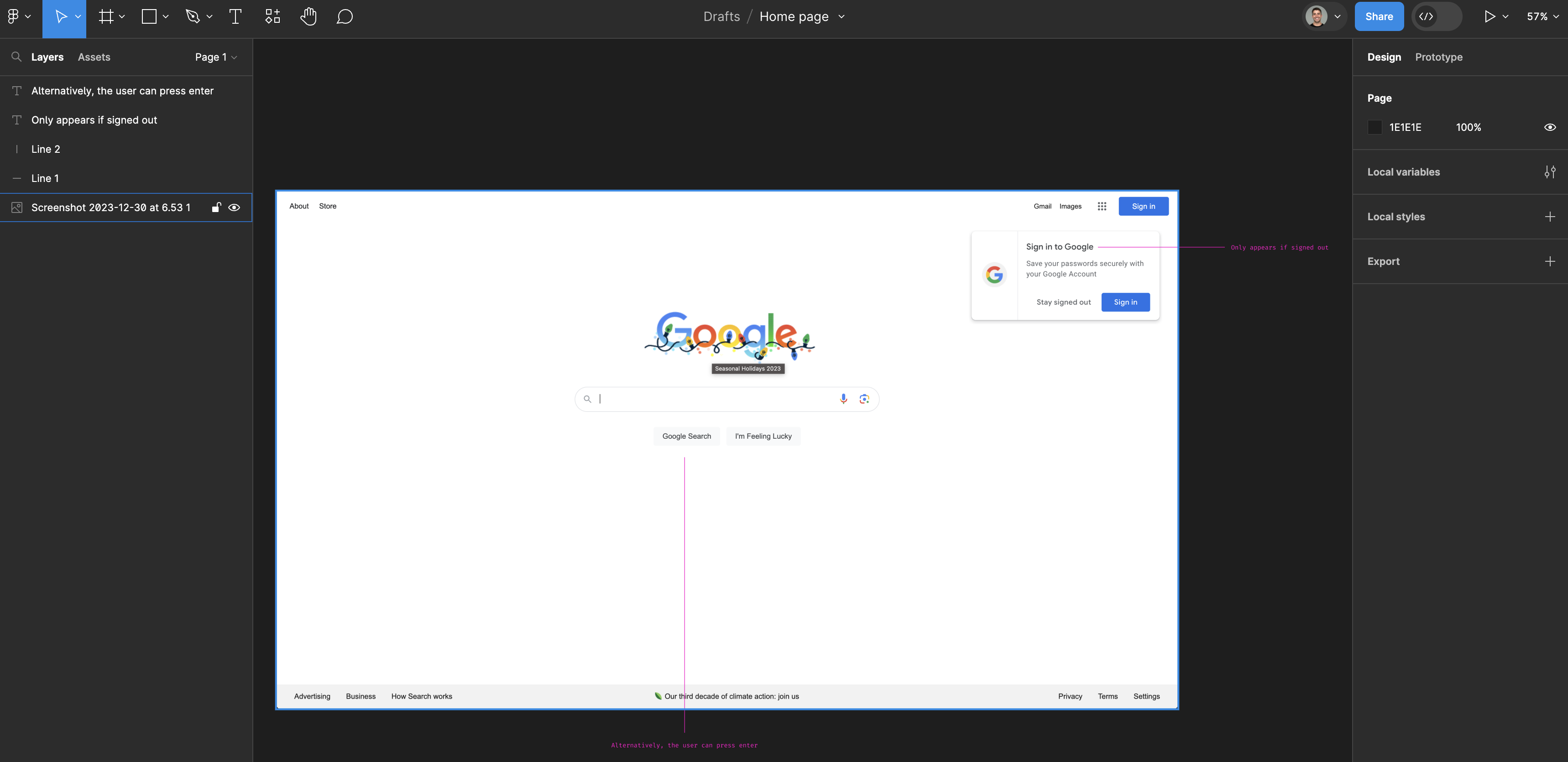
There are many ways designers hand off mocks, but these days, the most common is Figma :

Implementing mocks to be pixel perfect seems like a lot, but—in the same way there are with codebases—there are patterns and concepts that transcend the design and make it easier to understand.
If you want to build an eye for design, some good places to find inspiration are Muzli (a curated feed available as a browser extension), Mobbin (a searchable library of real-world mobile and web app designs), Detail (a collection of small design details that make a big difference), and Reading List (books recommended by industry designers).
Layout and the grid
One of the first things to note when looking at designs is how is it all laid out. In general, there are two approaches to laying out web pages:
- Fixed: The main content of the website has a maximum width it will grow to.
- Fluid: The main content of the webpage will expand to fill the screen.
For fixed layouts (and sometimes fluid ones as well, although less commonly), typically designs are made on a 8 or 12 column grid . This helps ensure items are visually aligned.
Spacing
Extending the idea of the grid, designers usually work with a common multiple for all paddings and widths. For example, by keeping all dimensions a multiple of 8px, it’s much easier to make sure that all elements on your site are aligned and for developers to identify whether the space between elements is meant to be 8px or 16px (something that’s easier to eye-ball than 8px or 7px).
Responsive design
Responsive design refers to a set of practices to make your webpage look good at various screen sizes. Progressive enhancement takes this a step further and designs for the most limited browser (typically mobile), adding in features as the browser or screensize can support them. A common analogy in the space is an escalator works as a stair, and if it has power it enhances to something more powerful.
Defensive CSS
In general, but especially if you’re app contains user generated content, it’s important to design for a wide variety of content (including extra-long content, foreign characters in usernames, and odd screen sizes) to make sure it does not mess up your layout.
A wonderful catalog of common techniques is defensive css .
Typography
Typography refers to the text and font-styles in an app. There are typically only a few of them (for example: heading, large heading, subtitle, body text), and each style defines a subset of:
- Font (Google fonts has many fonts for you to use)
- Font size
- Font weight (how bold the text is; a multiple of 100 between 100 and 900; default is 400, bold is 700)
- Color
- Line height (space between lines)
- Letter spacing (space between letters)
- Font style (e.g. italics) and decorations (e.g. underlined)
- Casing (e.g. all uppercase, sentence case, title case.)
Colors
There are usually only a few colors used within an app (the collection of which is called a palette). There are many ways to generate a palette, but they typically involve picking a primary color and some supporting secondary colors. To play around and learn more about what makes different colors look good together, there are plenty of tools to help you play with color harmony: Adobe , Coolors , Paletton , and Tints (which generates Tailwind CSS-compatible 50–950 shade scales from a single hex value).
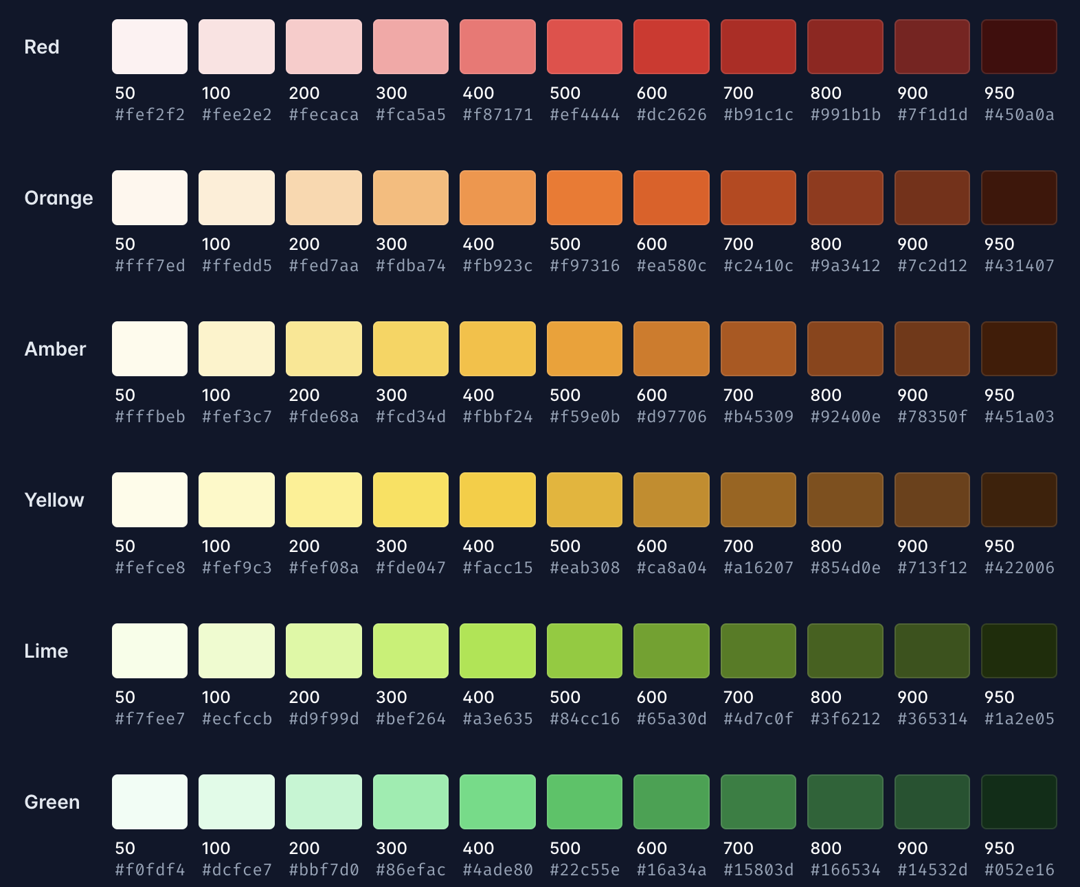
Once you’ve selected your colors, you need to pick the shades that will be used within your app. Increasingly commonly, developers will name their shades like font-weights (in increments of 100, with 100 being the lightest and 900 being the darkest). For example, here is Tailwind’s default palette (more on Tailwind later):

Themes
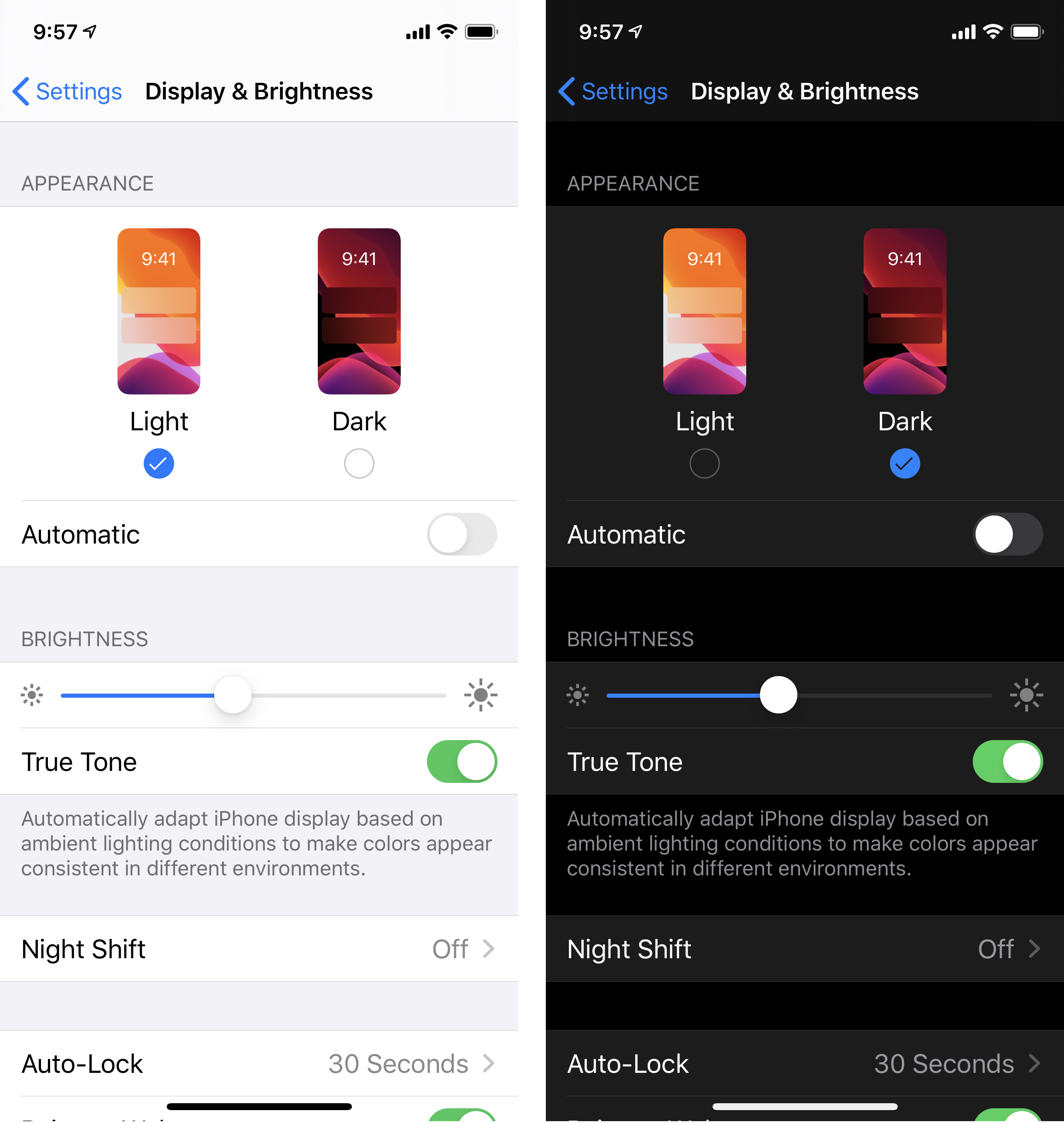
Increasingly, apps in general, including web apps, are expected to support multiple themes (or sets of colors). At a minimum, users expect a light (a set of colors that have a light background) and a dark mode (a set of colors with a dark background).

In CSS, themes are typically implemented with CSS variables (having variables for background or text colors). For dark theme inspiration, Dark Mode Design is a curated showcase of websites with dark color schemes.
Accessibility
An important, and often overlooked / under-invested-in, job of a frontend developer is to make sure everyone can use the web app; by everyone I mean everyone, including people who are colorblind, who are visually impaired, and who have trouble using a mouse. This is called accessibility (or a11y for short).
While there is a whole chapter, if not book, that could be written on accessibility, three things I’ll call out are:
- Ensuring colors are visible, text has sufficient contrast with its background, and buttons are big enough for people who have trouble using a mouse—or are accessing the page on a mobile device—to tap. This kind of stuff is typically covered by human interface guidelines (for example, here’s Apple’s human interface guidelines ) and handled by the designer.
- Ensuring your app is accessible to screen-readers (assistive technology that reads webpages to those who are visually impaired). The most basic thing you can do is ensure all images have an alt property; ultimately, you should ensure your components have the relevant ARIA properties and declare their role; for example, by annotating a dropdown menu, a screenreader can more easily navigate the content.
- Ensure your app is accessible via keyboard navigation. Frequently this involves setting the tabindex .
Components
Even with the above patterns, all the above is a lot to think about for every part of every page. As a web app grows, designers abstract parts of the page into components: rather than needing to think about typography and colors and padding for every part of the site, designers can simply place a “button”, and there is one canonical definition, complete with typography and colors and padding, for the button.
Some common components include buttons, text inputs, headings, a sidebar, etc. We’ll cover more components in the next section. For a reference of common components across many design systems, check out The Component Gallery . If you’re looking for ready-to-use effects and copy-and-paste snippets, Fancy Components offers playful React + Tailwind components and microinteractions, ui.ibelick has dark-mode-first component effects, animation.ibelick is a gallery of Tailwind CSS animations, and bg.ibelick provides ready-to-use background snippets.
Utility classes
In a perfect world, every possible semantic concept would have a component, and developers would not need to design anything outside of the design system. Unfortunately, we do not live in a perfect world and such a design system would be really extensive to make and maintain.
A mid-way solution is to create css “utility classes” (or single purposes classes) that make it easier to create new components, so rather than having to create a new component or style for a page which needs to center its contents, I can instead write:
<div class="flex justify-center">
  ...
</div>
UI patterns
As you start to look at more mocks through the lens of frontend development, and build out your own components, you’ll notice patterns and concepts that transcend the specific style. While different places call these elements different things, below are some of the common patterns you’ll encounter.
Containers and layout
Most web pages have some content at the top (called a header or navbar, as it’s often used for navigation), some content in the middle, and some content at the bottom of the page (called a footer). If the header or footer follow you as you scroll, they are referred to as sticky (e.g. a sticky header). For landing page layout inspiration (with Figma templates), check out Landingly .
In addition, many sites have a column to the side of the content (typically used for navigation): a sidebar.
Within the content of the page or in the sidebar:
- A section is probably the most generic term and refers to any part of the page.
- A panel is a section that is well defined (has a border or distinct background).
- A card is a panel that is stand-alone and typically appears elevated above the content.
- A drawer is a card or panel that the user can click on to expand.
- An accordion is a stack of drawers.
- A banner is a panel at the top of the content (or above the navbar) spanning the width of the page (or almost the width) and informing the user of something, and
- A callout is a banner, that’s not at the top of the page.
Sometimes you have many different pieces of content that need to fit in the same section:
- If you can click on labels to see that different content, you have tabs
- If the different content automatically cycles between itself, you have a carousel.
Inputs
Within the content, you may have text, images, and inputs: elements that the user can use to enter data. For historical reasons, these elements are sometimes referred to as “form elements” (referencing a physical paper form that has checkboxes and space for written answers).
Some common form elements are:
- Buttons: A button is probably the most straightforward element. You click it, and something happens. Optionally, a button will have a chevron next to it allowing you to pick other actions. Like all form elements, buttons can be disabled (this means they show up as non-interactive).
- Toggles: Toggles let the user pick between some predefined states.
- Checkbox : A box that the user can check or not.
- Radio button : A group of checkboxes where only one is selectable.
- Toggle : Functionally the same as a checkbox, but communicates you’re turning something on or off.
- Dropdowns: Another way to let users pick between options is a dropdown . The user clicks on a button and opens up a menu where they can select one (or more) options.
- If this menu has a search box, it’s called a combobox .
- Textboxes: Lastly, sometimes users need a place to input text. This is a textbox . A textbox can have some type of validation, for example, calendar , phone, or number validation (which optionally pop up additional UI). A textbox can autocomplete. If a textbox can autocomplete and select multiple options, it’s called a pill selector : as the options are usually shown as “pills” in the textbox. If the textbox is many lines, it is called a textarea .
Lastly, while not technically a form element, menus add additional functionality without cluttering the UI.
If a button opens an additional piece of UI (that floats above the rest of the content), this is generally called a popover . Popovers are frequently used to implement menus. (If, instead, the user hovers to bring up a popover, this is called a tooltip or hovercard. These are usually informationally.)
The most common type of menu you’ll see in designs is a kebab or hamburger menu (named after the icon). Typically hidden in the top right of content. Clicking this menu opens a popover.
A menu opened on right click is called a context menu .
One specific element which is increasingly common is a command bar , it is usually summoned with “command k” and allows the user to pick among options.
Stateful UI
When building data rich applications, three common states developers need to handle are:
- An error state: when the data can not be fetched or rendered,
- An empty state: when there is no data; also called a null state, and
- The loading state: when the data is still being loaded
Some common loading states are:
- Spinners : useful when it’s not known how long data will take to fetch.
- Shimmers : similar to a spinner; minimizes layout shift by taking the rough shape of the final content.
- Progress bar : shows how much progress has been made. When fetching data for a page, it’s becoming increasingly common to show at the border of the page or element.
On the flip side, a user may need to be guided through specific steps in a specific order.
If you display something above the content that disables interaction with things below it, it’s called a modal (sometimes called a dialog; however a common difference is a dialog doesn’t prevent interaction with the other content below it). If the modal is attached to the side of the screen it’s called a sidepanel. If it comes from the bottom of the screen (common on mobile), it’s called a bottom sheet.
Off-the-shelf systems
Everything above comprises the design system. In an ideal world, new pages need minimal design intervention, because there is a self-evident way to build what needs to be built given the design system.
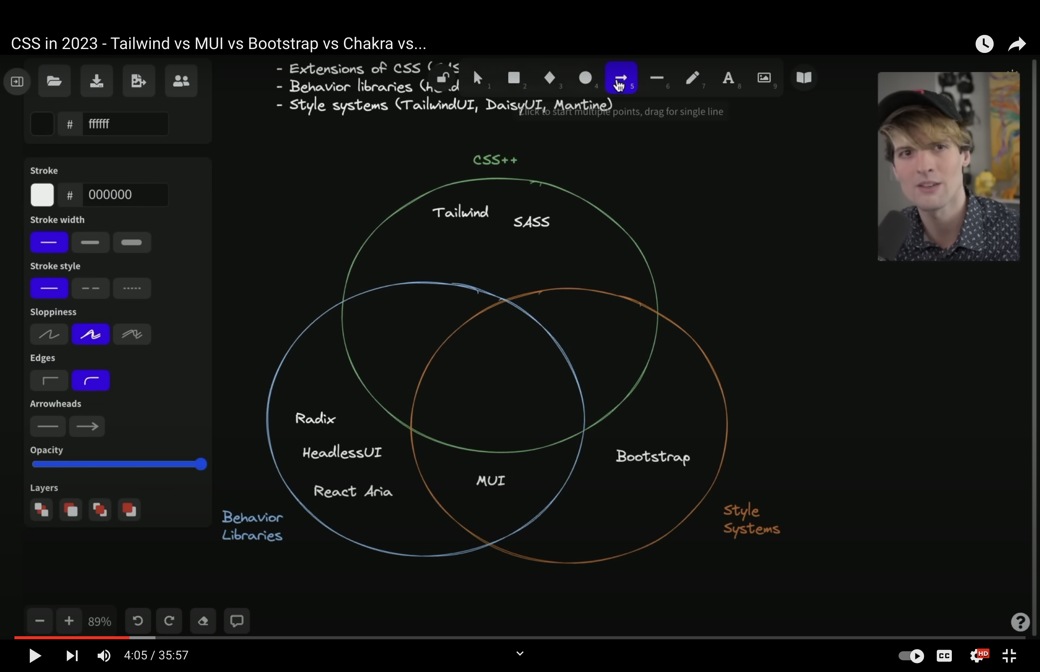
Building a design system is a serious undertaking, and one that many developers chose to forego. There are many off-the-shelf systems that one can choose to use. Theo.gg has a good video describing the multiple types of design systems that exist.

Some notable examples are:
- Bootstrap : a full design system, includes colors, typography, fully-built components, etc.
- Radix : the functionality of a design system with none of the visual design. You still need to bring your own colors and typography, but it will implement the user experience: keyboard shortcuts, hover states, etc.
- Tailwind : the opposite of Radix, design with little functionality. Provides default colors, typography, etc.
- ShadUI : “Not a design system”, provides copy-and-pastable components to use.
Also, many companies open source their design systems, for example: Google , Adobe , GitHub , and Vercel .
